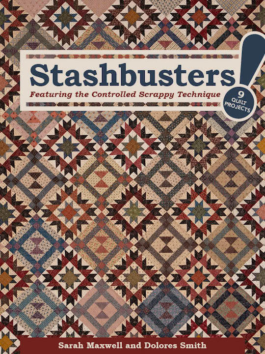
Choosing Fabric with Stashbusters!
Posted by Deirdre Quirk on Apr 21st 2016
As quilt shop owners, Sarah Maxwell and Dolores Smith get a lot of questions about how to choose fabrics for a quilt. So in their new book, Stashbusters!, they made sure to cover a few of their favorite approaches, including controlled color placement, a limited palette, and a focal fabric. And these gals are true experts—even if you think you know how to work with one of these color schemes, Sarah and Dolores throw in plenty of tips that'll have you going, "Oh, I never thought of that!"
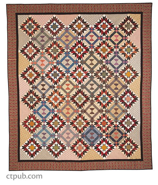
A great example of a controlled placement color scheme is the stunning cover quilt, Scrappy is as Scrappy Does. Sarah wanted to use a wide range of fabrics in the quilt (there are more than 50 in the final design!), so she decided to plan where each color would appear, controlling the randomness of the design. Black and red were used to anchor the Odd Fellow's Chain blocks, and she settled on a black and red border to tie the whole quilt together.
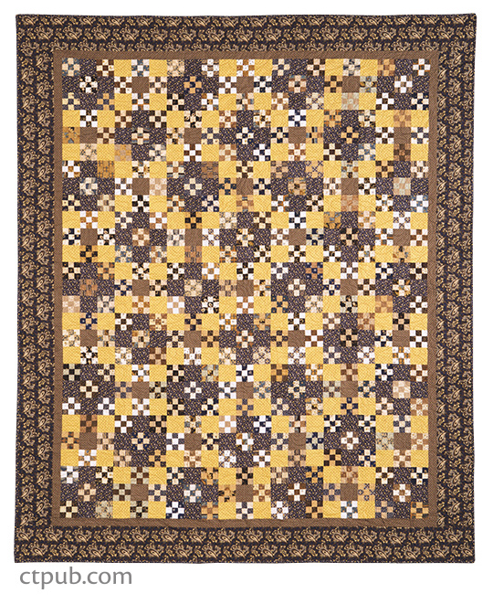
Blueberry and Butter shows off the power of a limited palette color scheme. By sticking to only blue, brown, and yellow fabrics, Sarah ensured the quilt would come together beautifully—plus, the distinctive color scheme gave the quilt its name! One of her best tips? Look for fabrics that combine the colors you've chosen for your palette.
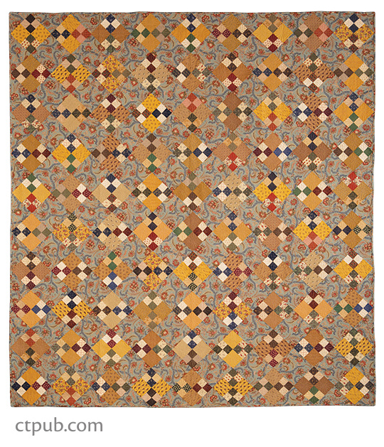
We've all heard of the idea of choosing a focus fabric for your quilt—a fabric you love with three or four colors that guides your color choices for the rest of the quilt. It's All about Love takes this concept and runs with it, including anywhere from four to ten different fabrics for each color drawn from the focal quilt. Plus, Sarah works in brighter greens and reds, adding a spark to the quilt and drawing the eye.
How do you choose colors for your own quilts?