Choosing Color Effectively
Posted by Cindy Grisdela on May 3rd 2017
When you think about choosing colors for your next quilt, are you energized or intimidated? Choosing colors is one of my favorite parts of the quilting process ,and I’d like to share a few thoughts on what works for me.
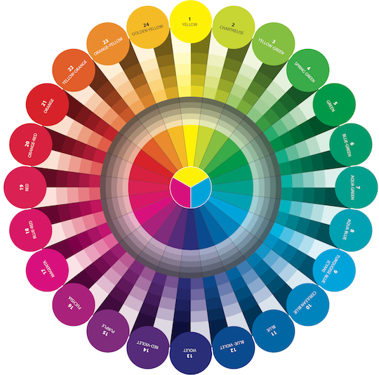
There are three primary colors: red, blue, and yellow. Combining these colors gives you what are known as secondary colors: violet, green, and orange. If you look at the color wheel below, the colors on one side, ranging from yellow to orange to red, are known as warm colors, and the colors on the other side, from green to blue to purple, are thought of as cool colors.
I almost always start a new quilt with a color idea, or recipe, as I like to call it. I think about what sort of feeling I want to convey first. If I’m in the mood for an assertive, energetic design, I’m likely to be drawn to the warm side of the color wheel. But if I want to convey a calmer, quieter mood, I will probably lean towards the cooler colors.
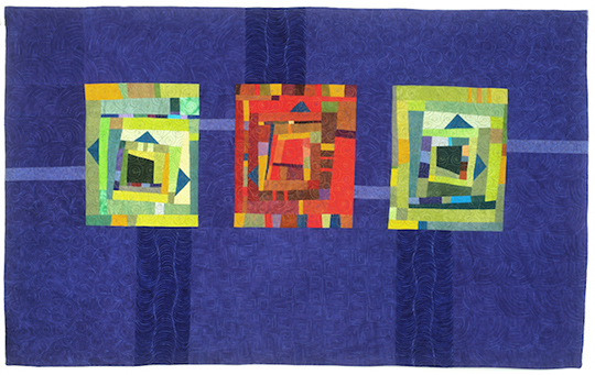
Journey Home, above, has a primarily cool color recipe of greens and blues. The warm red Improv Block in the center provides a focal point and a pop of contrast that makes the entire composition more interesting.
In my book, Artful Improv: Explore Color Recipes, Building Blocks & Free-Motion Quilting , I discuss four basic color recipes that I find a useful starting point for thinking about color.
A monochromatic color recipe is one of the easiest to use, since it requires only one color family. The concept of value is important in a monochromatic color recipe. Whether a particular fabric reads as light, medium, or dark is essential to making this recipe work. Light colors typically have white added to them and are known as tints. Dark colors have black added and are known as shades. Often the value of a particular fabric depends on the fabrics next to it. For example, a medium fabric might read as light next to a very dark shade, or dark next to a lighter tint. Seahorses, below, is an example of a monochromatic color recipe using a variety of green values.
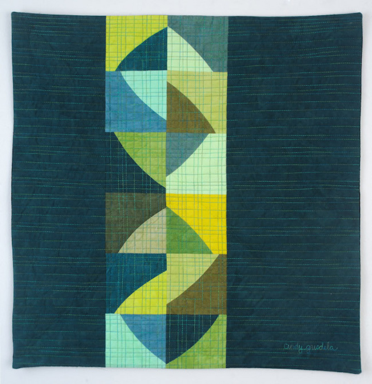
One drawback of a monochromatic color scheme is the risk that the composition feels predictable or boring. Another color recipe that is often more interesting is known as analogous. An analogous scheme uses colors that are next to each other on the color wheel, such as blue, green, and purple or red, orange, and yellow. Sunset Swirls, below, was designed with purples and greens for a harmonious composition.
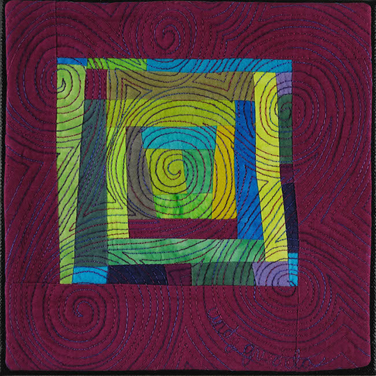
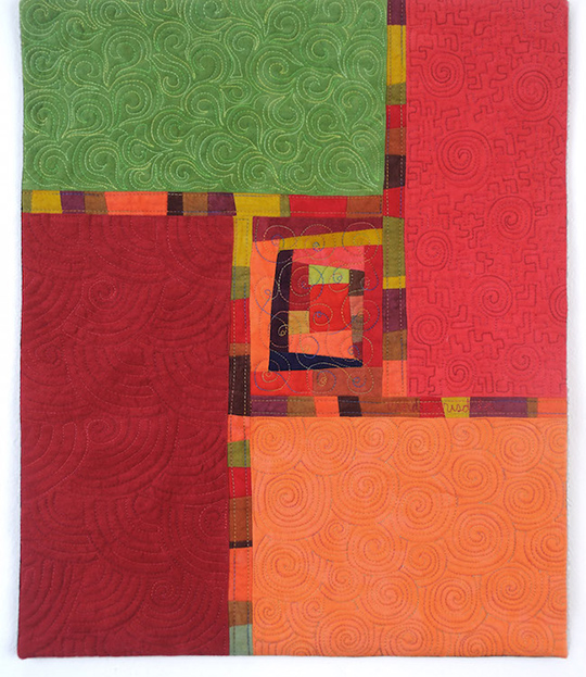
Complementary color recipes using colors opposite each other on the color wheel have a lot of energy. Think orange and blue, red and green, or yellow and purple. Because quilts using this type of color scheme are so active, often it’s a good idea to choose one of the colors and add the other as an accent. In Red Zinnia, I used mostly warm reds and oranges, with the complementary green added in the upper left quadrant.
I rarely use any of these color recipes as is; they are merely the starting point for the design. One of my best color tips is to always “add the spark.” If you’re using an analogous color recipe of red, orange, and yellow, consider adding a hint of the complementary green to help move the eye around your composition and add an interesting accent, as I did in Summer, below.
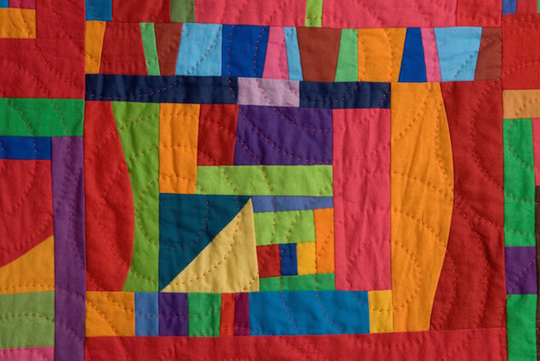
And there’s always a place for what I call the “Anything Goes” color recipe, which uses all the colors of the rainbow in the same quilt ! Jazz Rhythms, from the cover of Artful Improv , is a great example of that type of recipe.
I hope these tips will help you use color successfully in your next project. Visit my website at https://cindygrisdela.com for more information about my process and inspiration.