Building a Stash of Colors for Your Quilts
Posted by Leni Levenson Wiener on Apr 14th 2017
I am often asked about my favorite colors, but it is important to understand there is a distinction between my favorite colors and those I use in my art. My favorite colors are turquoise and a color my friends call Leni Red (which is an orange/red I wear a lot and that dominates my house). Although this Leni Red does pop up frequently in my work, the turquoise almost never does.
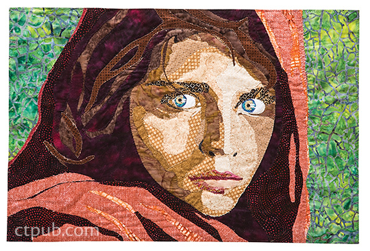
Because my work is figurative in nature, I use a lot of beige fabrics—it is hard to find truly neutral beiges for skin tones with no undertone of yellow or blue or red, so when I see them I buy them and organize them in a bin by value so they are easy to use. I also use a lot of black, as I love the contrast it provides in my artwork. And by the way, I never use solid fabric; everything I buy is a pattern. It makes the final artwork more complex and interesting.
Here is the most important advice I can give you about building a stash of colors for your quilts (whether art quilt or traditional quilt)—whatever you tend to buy a lot of, buy its complement as well. So if you buy a lot of blue fabrics, buy at least some options in orange. Why? Because even a little hint of the complementary (opposite) color will bring life and visual excitement to your work. At the very least, if you use a lot of warm-tone colors like red, orange and yellow, mix in some cool colors like blue and green, or vice versa.
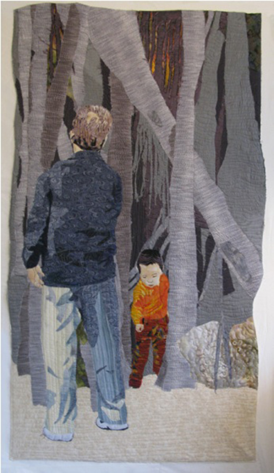
The Boy in the Banyan Tree. This illustrates the importance of using just a bit of a complementary color in your project. By putting the boy in orange clothing in a composition that is predominately blue and gray, he stands out and instantly becomes the focal point of the artwork.
Overwhelmed by a color wheel and just want an easy way to find the opposite of a color? You probably already know the basics—the three primary colors are red, blue and yellow; if you add two of them together, the remaining color is its opposite. So, for example, if red and blue make purple, the remaining primary (and therefore the opposite of purple) is yellow. That part is easy, but what happens when the colors get more nuanced? Think color recipe.
My red/orange for example—green is the opposite of red and blue is the opposite of orange. So what is the opposite of a red/orange—a green/blue or teal tone. More orange than red in the original mix? Something with more blue than green in the opposite color will be the complement. This is how I find color without a color wheel. Easy!
For more tips on choosing and using color, pick up my book, the Pictorial Art Quilt Guidebook.